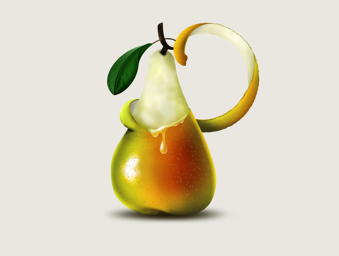
Scottish illustrator Steven Bonner has created a beautiful typeface for Ballantine’s Scotch Whisky that reflects the tasting notes of the brand’s 12-year-old Scotch. The illustrator has created several illustrated letters, each of which represents one of the main tasting notes found in the whisky, including cream, oak and pear.

For instance, the letter ‘C’, crafted to look like a slice of orange, stands for the citrus note. "My involvement was split into two parts," he says. "Firstly, I illustrated the seven main tasting notes as illuminated letters, each letter telling the story of it's own flavour. The illustrations were then animated as part of an introductory story that asks you to 'Go Beyond' the blend and explore the notes that make up this premium blend.
"Secondly, I designed a custom typeface which the viewer could use to create their own customized Facebook cover image," says Steven. "The typeface uses two versions of each letter with an ornate version and a simpler version so the user can mix and match letters to create their own logotype."
These flavorful letters are used in an illustrated animation that you will find on the Ballentine’s website.