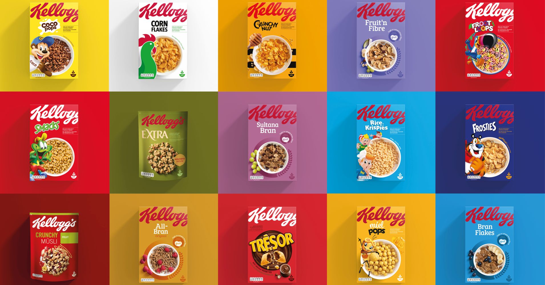
Kellogg’s gets rid of all the clutter in the packaging and recently introduced the brand’s cereal packaging design to make them easier to identify.
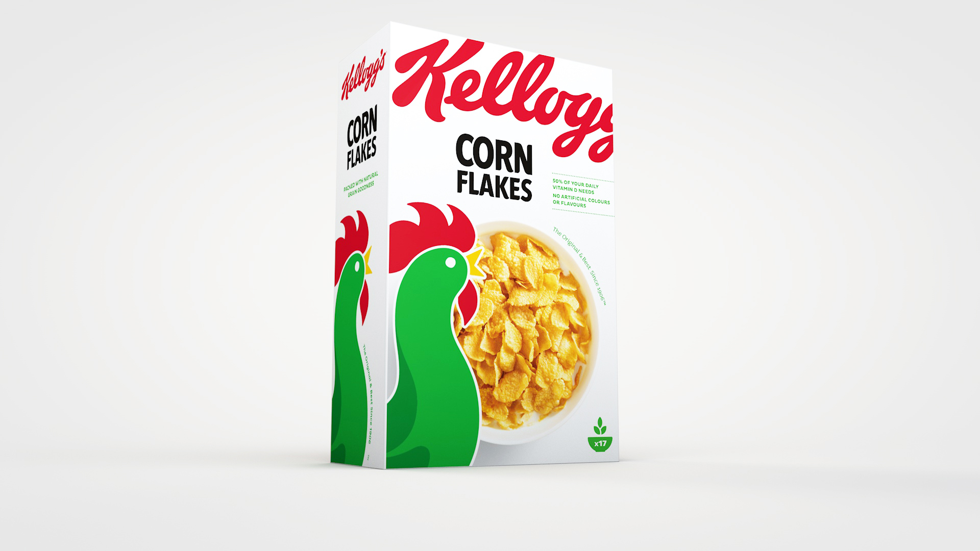
Kellogg's teamed up with agency Landor to redesign packages including the likes of ‘Corn Flakes’, ‘Crunchy Nut’, and ‘Coco Pops’ and give it a “cleaner look.”
Landor has incorporated a larger Kellogg’s logo and uses consistent photography throughout the range. The new boxes will include top-down images of the cereal bowls, thereby abandoning graphics of edited spoons and splattered milk for a more natural and realistic approach.

The characters of each cereal, such as ‘Tony the Tiger’ for ‘Frosties’ and the green ‘Corn Flakes’ cockerel, will still be displayed in the same bottom left position on their respective boxes. Landor has also created icons that will aid customers in easily understanding the different ingredients in each cereal.
The new design was put in place based on feedback from consumers, who found Kellogg’s packaging to be not-very-prominent. Hopefully, the changes will help the company to stand out among the competitors, while channeling transparency and provenance.